In 1569, a Flemish geographer named Gerardus Mercator published a world map that would shape how humans see the planet for the next 457 years. The map was 202 by 124 centimeters, printed in 18 separate sheets, and its full Latin title translates to “A new and augmented description of Earth corrected for the use of sailors.” That subtitle is the whole story. The map was built for navigation, not for understanding the world.
How the Mercator projection works
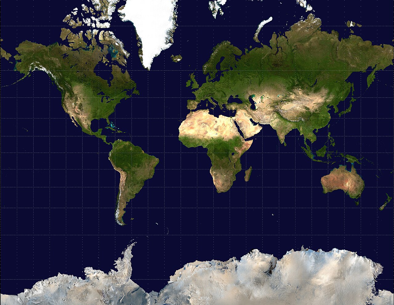
The Mercator projection preserves angles. A straight line drawn anywhere on the map represents a line of constant compass bearing, called a rhumb line. A sailor could draw a line from Lisbon to Havana, measure the angle, hold that bearing, and arrive at the right port.
Before Mercator, this was not possible on any flat map.
The tradeoff is area. To make the angles work, Mercator stretched the map progressively toward the poles. At the equator, the scale is accurate. At 60 degrees north, areas are inflated by a factor of four. At 80 degrees north, they are inflated by about 33 times. The math is precise and predictable, but the visual result is dramatic.
How it distorts country sizes
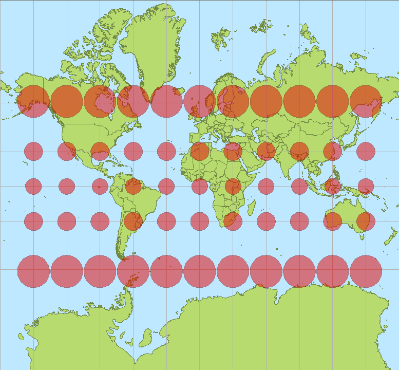
Open any Mercator map and Greenland sits at the top, enormous. It looks roughly the same size as Africa. You could be forgiven for thinking they are comparable landmasses.
Greenland is about 2.1 million square kilometers. Africa is about 30.4 million square kilometers. Africa is 14.4 times larger than Greenland. On a Mercator map, they look the same size.
The distortion is worst at the poles. Antarctica appears to stretch across the entire bottom of the map. In reality, it is less than half the size of Africa. Russia and Canada appear to dominate the globe, but Mercator makes them look like they take up half the planet. They do not.
How it ended up on every screen
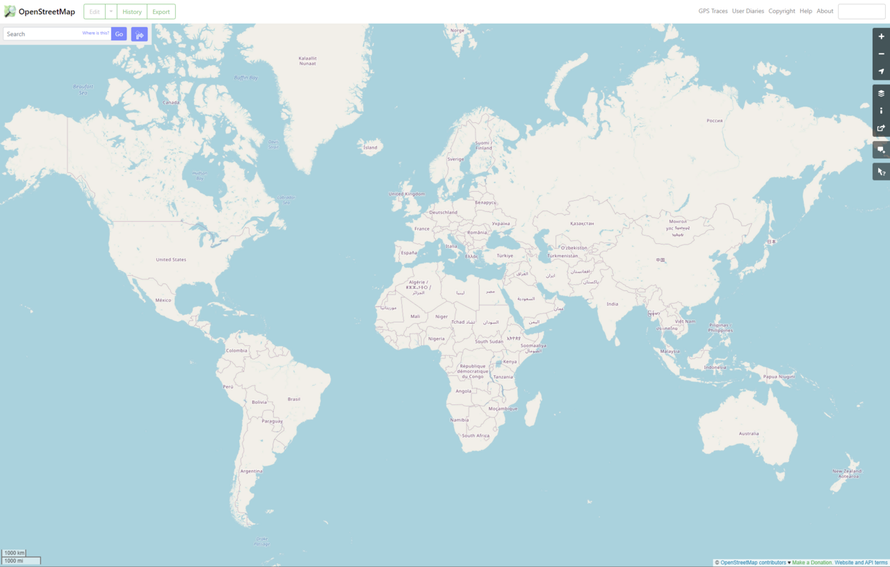
Google Maps adopted a variant called Web Mercator in 2005. It became the de facto standard for web mapping. Bing Maps, OpenStreetMap, Mapbox, and Esri all use the same projection.
The reason is practical. At the street level, Mercator preserves angles and shapes. A square building looks square. A right turn at an intersection is a right turn on the map. For navigation, which is what most people use maps for, this matters more than accurate area proportions.
There is also a technical reason. Mercator is easy to tile. Web maps load small square tiles as you scroll, and Mercator tiles fit together at every zoom level. An equal-area projection would require different tile sets at different latitudes, which is harder to build and slower to load.
The US Department of Defense has declared Web Mercator “unacceptable for any official use.” Mistaking it for standard Mercator during coordinate conversion can cause deviations of up to 40 kilometers on the ground. For everyday use, this does not matter. For military operations, it does.
How other projections fix the problem
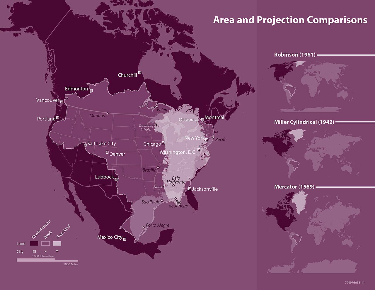
Several projections preserve correct area proportions. Each makes different compromises.
- Gall-Peters (1855/1973): Equal-area projection. Shows correct relative sizes of all landmasses. Shapes are distorted, and countries near the equator appear stretched vertically.
- Equal Earth (2018): Equal-area projection designed to be more aesthetically pleasing than Gall-Peters. Backed by the African Union’s “Correct the Map” campaign.
- Robinson (1963): Compromise projection that reduces the worst distortions of both area and shape. Used by National Geographic from 1988 to 1998.
TheTrueSize.com, created in 2013 by Detroit developers James Talmage and Damon Maneice, makes the distortion tangible. The tool lets you drag countries across the globe to compare their actual sizes. It was partly inspired by Kai Krause’s “The True Size of Africa” and an episode of The West Wing.
How institutions are pushing back
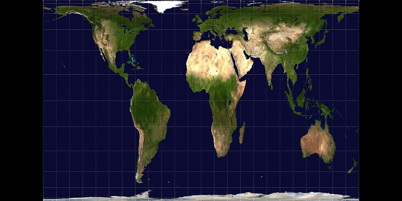
The Mercator projection inflates the northern hemisphere and shrinks the global south. Maps shape how people perceive power, relevance, and identity. When Africa appears smaller than it is, and Europe and North America appear larger, it reinforces a particular view of which parts of the world matter.
In 1989 and 1990, seven North American geographic organizations adopted a resolution recommending against using any rectangular projection for reference maps of the world. In 2017, Boston Public Schools switched to the Gall-Peters projection.
In 2024, Nebraska passed a law banning Mercator maps in public schools starting in the 2024-25 school year. Schools must use Gall-Peters, AuthaGraph, or similar equal-area projections instead. Mercator may only be used if another projection is also shown in the same lesson.
In August 2025, the African Union endorsed the “Correct the Map” campaign, urging governments and international organizations to replace Mercator with the Equal Earth projection. The AU’s deputy chairperson, Selma Malika Haddadi, said the change would help reclaim “Africa’s rightful place on the global stage.”
The Mercator projection is not wrong. It does exactly what it was designed to do. The problem is that what it was designed to do, help 16th-century sailors navigate, is not what most people use it for today.