The Mercator Projection: What It Is and Why Your World Map Is Wrong

In 1569, a Flemish geographer named Gerardus Mercator published a world map that would shape how humans see the planet for the next 457 years. The map was 202 by 124 centimeters, printed in 18 separate sheets, and its full Latin title translates to “A new and augmented description of Earth corrected for the use of sailors.” That subtitle is the whole story. The map was built for navigation, not for understanding the world.

How the Mercator projection works
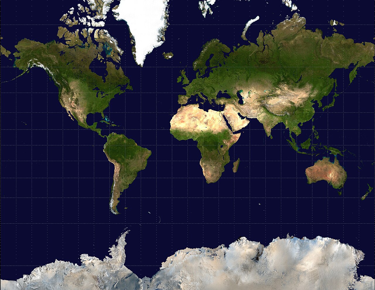
The Mercator projection maps the globe onto a cylinder, preserving compass bearings at the cost of area distortion near the poles

The Mercator projection preserves angles. A straight line drawn anywhere on the map represents a line of constant compass bearing, called a rhumb line. A sailor could draw a line from Lisbon to Havana, measure the angle, hold that bearing, and arrive at the right port.

Before Mercator, this was not possible on any flat map.

The tradeoff is area. To make the angles work, Mercator stretched the map progressively toward the poles. At the equator, the scale is accurate. At 60 degrees north, areas are inflated by a factor of four. At 80 degrees north, they are inflated by about 33 times. The math is precise and predictable, but the visual result is dramatic.

How it distorts country sizes
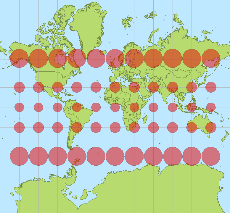
Tissot's indicatrix on a Mercator map shows how circles at the equator become increasingly stretched into ellipses toward the poles

Open any Mercator map and Greenland sits at the top, enormous. It looks roughly the same size as Africa. You could be forgiven for thinking they are comparable landmasses.

Greenland is about 2.1 million square kilometers. Africa is about 30.4 million square kilometers. Africa is 14.4 times larger than Greenland. On a Mercator map, they look the same size.

The distortion is worst at the poles. Antarctica appears to stretch across the entire bottom of the map. In reality, it is less than half the size of Africa. Russia and Canada appear to dominate the globe, but Mercator makes them look like they take up half the planet. They do not.

How it ended up on every screen
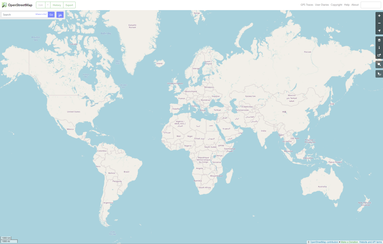
OpenStreetMap, like most web mapping platforms, uses the Web Mercator projection for its tile-based interface

Google Maps adopted a variant called Web Mercator in 2005. It became the de facto standard for web mapping. Bing Maps, OpenStreetMap, Mapbox, and Esri all use the same projection.

The reason is practical. At the street level, Mercator preserves angles and shapes. A square building looks square. A right turn at an intersection is a right turn on the map. For navigation, which is what most people use maps for, this matters more than accurate area proportions.

There is also a technical reason. Mercator is easy to tile. Web maps load small square tiles as you scroll, and Mercator tiles fit together at every zoom level. An equal-area projection would require different tile sets at different latitudes, which is harder to build and slower to load.

The US Department of Defense has declared Web Mercator “unacceptable for any official use.” Mistaking it for standard Mercator during coordinate conversion can cause deviations of up to 40 kilometers on the ground. For everyday use, this does not matter. For military operations, it does.

How other projections fix the problem
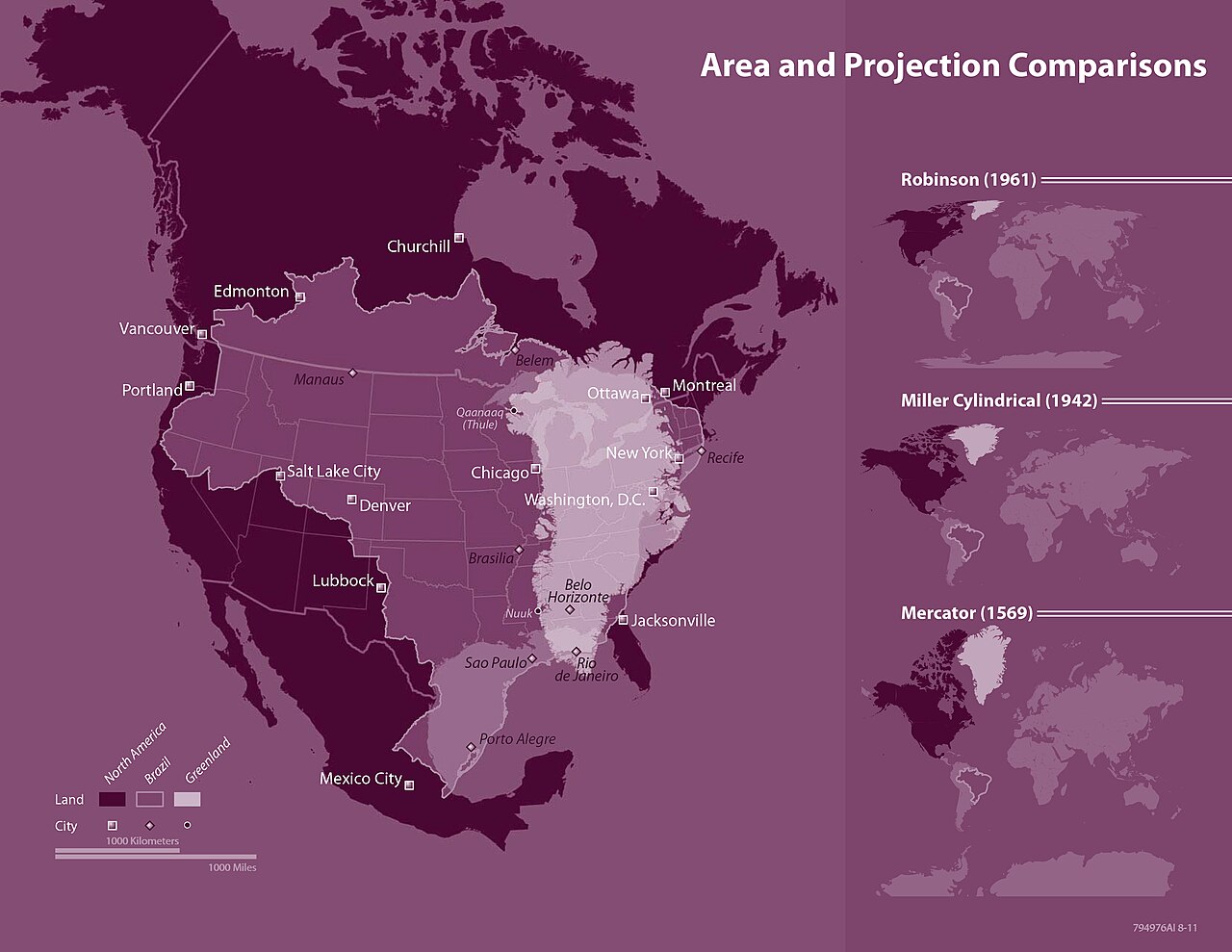
Side-by-side comparison of map projections showing how different approaches handle the tradeoff between area accuracy and shape preservation

Several projections preserve correct area proportions. Each makes different compromises.

  • Gall-Peters (1855/1973): Equal-area projection. Shows correct relative sizes of all landmasses. Shapes are distorted, and countries near the equator appear stretched vertically.
  • Equal Earth (2018): Equal-area projection designed to be more aesthetically pleasing than Gall-Peters. Backed by the African Union’s “Correct the Map” campaign.
  • Robinson (1963): Compromise projection that reduces the worst distortions of both area and shape. Used by National Geographic from 1988 to 1998.

TheTrueSize.com, created in 2013 by Detroit developers James Talmage and Damon Maneice, makes the distortion tangible. The tool lets you drag countries across the globe to compare their actual sizes. It was partly inspired by Kai Krause’s “The True Size of Africa” and an episode of The West Wing.

How institutions are pushing back
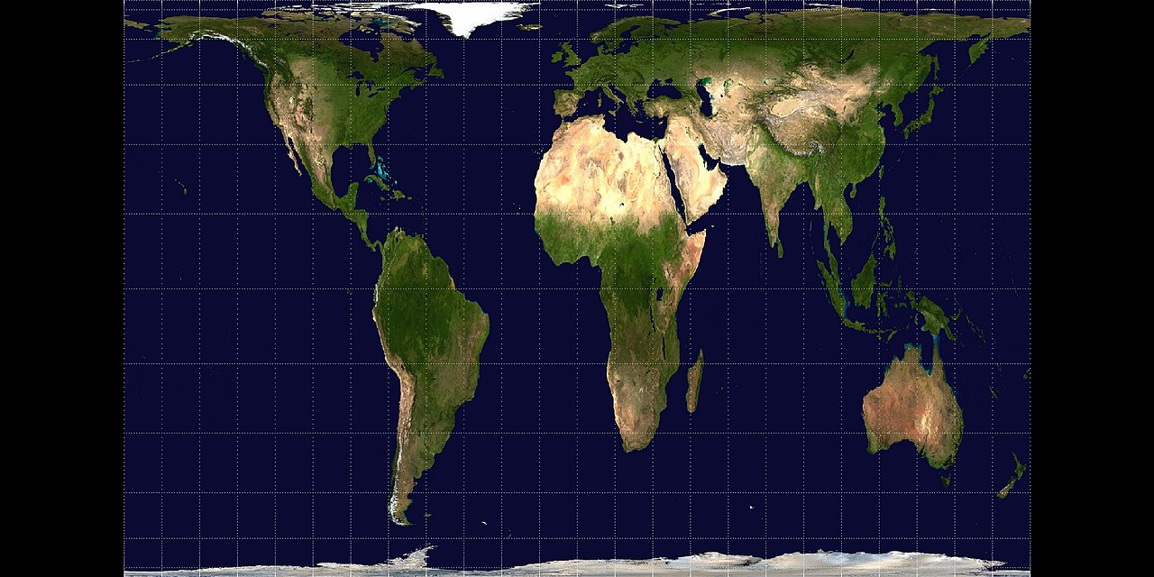
The Gall-Peters projection shows all landmasses at their true relative sizes, making it the leading alternative to Mercator in educational settings

The Mercator projection inflates the northern hemisphere and shrinks the global south. Maps shape how people perceive power, relevance, and identity. When Africa appears smaller than it is, and Europe and North America appear larger, it reinforces a particular view of which parts of the world matter.

In 1989 and 1990, seven North American geographic organizations adopted a resolution recommending against using any rectangular projection for reference maps of the world. In 2017, Boston Public Schools switched to the Gall-Peters projection.

In 2024, Nebraska passed a law banning Mercator maps in public schools starting in the 2024-25 school year. Schools must use Gall-Peters, AuthaGraph, or similar equal-area projections instead. Mercator may only be used if another projection is also shown in the same lesson.

In August 2025, the African Union endorsed the “Correct the Map” campaign, urging governments and international organizations to replace Mercator with the Equal Earth projection. The AU’s deputy chairperson, Selma Malika Haddadi, said the change would help reclaim “Africa’s rightful place on the global stage.”

The Mercator projection is not wrong. It does exactly what it was designed to do. The problem is that what it was designed to do, help 16th-century sailors navigate, is not what most people use it for today.

I map blockchain networks for a living. Our company card had to change.

Six years ago I drew coastlines and trail networks. Now I spend most weeks turning blockchain data into maps: where the validators actually sit, how value moves between chains rendered as something a human can read. The work is still cartography. The clients just pay in stablecoins.

That last part broke my company card before I understood why.

The money showed up fine. Spending it was the problem.

A protocol in Singapore commissions a set of network maps. They pay in USDC, in an afternoon, no wire sitting in limbo for a week. Lovely. Then the balance sits in a company wallet, and every business expense I have (the mapping software licenses, the cloud rendering, the contractor in Lisbon who does my typography) wants a normal card and a normal currency.

For a while I did the clumsy dance. Move stablecoins to an exchange, sell for dollars, wait for the dollars to reach the business account, spend from the company debit card. Three steps, two fees, and a conversion spread I could never quite see clearly, on every single expense.

What actually fixed it

A founder I make maps for asked why I wasn’t funding the spend straight from the stablecoin balance. I didn’t have an answer, so I looked into a corporate card that runs on stablecoins instead of a credit line.

The shift is small to describe and large to live with. The card spends the company’s own stablecoin balance. There’s no convert-to-dollars-first step, because the conversion happens at the point of sale, once, in front of me. The money leaves the company balance when the card taps, not three days later when a pending charge finally decides to commit.

A few things surprised me.

The spend is money we already have. A corporate credit card is a short loan the company pays back later. Funding a card from a balance we already hold means I can’t hand a contractor a payment the business doesn’t actually have yet. For a studio whose income arrives in lumps, that’s calming in a way I didn’t expect.

The fees moved into the light. My old setup charged a spread when I sold stablecoins for dollars, quietly, off where I’d never look. The card charges a conversion fee too, but it’s on the transaction, a number I can compare. I’d rather pay a fee I can see.

The record builds itself. Every purchase lands already tagged: the merchant, the category, the moment it cleared. My month-end admin used to eat most of a day, digging receipts out of email. Now it’s about 20 minutes, and I get that time back to draw.

When the boring setup still wins

I haven’t thrown out the normal account. Clients who pay in plain dollars, and most still do, land in the normal account and get spent the normal way. The credit line is occasionally useful. I’m not routing every coffee through a wallet for sport.

The rule I landed on is simple. Match the card to the shape of the money. Income that arrives as stablecoins gets spent from the stablecoin card, because forcing it back into dollars first pays a toll for nothing. Income that arrives as dollars stays on the old card.

Turns out the business under the maps runs on the same principle as the maps themselves. Work out how the thing actually moves, then draw the route that wastes the least.

The Quiet Art of the Disputed Border

Open a map on your phone from two different countries and you may be looking at two different worlds. The same border shows up solid in one place. In another it’s dashed, or dotted, or gone entirely. That difference is one of the most delicate jobs in cartography, and it usually happens without anyone noticing.

The line that changes depending on where you stand

A border is a claim, and disputed borders are places where two claims overlap and neither side will yield. Kashmir is the classic case. India, Pakistan, and China all hold pieces and all claim more. Map the region for an Indian audience and the whole territory reads as Indian. Map it for a Pakistani one and the line moves. Some map providers literally serve different borders depending on which country you’re viewing from, quietly redrawing the world to match the law of wherever you happen to be standing. The map is answering a different question for a different room.

How mapmakers hedge

When a cartographer can’t take a side, there’s a small visual grammar for saying “this is contested.” A dashed line instead of a solid one. A different color. A note printed on the territory: “boundary claimed by both parties,” or the careful phrase “administered by,” which describes who runs a place without blessing who owns it. That word, administered, is doing an enormous amount of diplomatic work. It says someone is in charge here without saying they have the right to be.

These are not neutral choices even when they try to be. A dashed line tells one side you refuse to recognize their claim as settled. Sometimes that’s the most honest thing a map can do. Sometimes it’s enough to get the map banned.

When the map becomes the fight

Countries take this seriously enough to legislate it. Some governments require that maps sold within their borders show the “correct” version, meaning their version, and getting it wrong can mean fines or a pulled product. A single dotted line in the wrong spot has held up the release of atlases and even films. The map becomes a front in the conflict.

I think about the cartographers who sit in the middle of this. Their job is supposed to be accuracy, and here accuracy is the one thing that’s impossible, because there is no single true answer to draw. Two governments, two peoples, two versions of history, and one line that has to go somewhere. Whatever they draw, someone calls it propaganda.

The honest dotted line

There’s a strange kind of integrity in the dashed border. A solid line pretends the question is closed. The dashes admit it isn’t. They say, right there on the paper, that the world has an argument running through this spot that no map can resolve, and that the mapmaker knows it.

Most of us read maps as settled fact, the world as it simply is. Disputed borders are the places where the map drops that pose and shows its hand. Somebody drew this. Somebody had to choose. And where they couldn’t choose, they left a row of little dashes, a quiet confession that the ground under that line is still being argued over by people who both call it home.

Next time you spot a dotted border, slow down and look. That’s a mapmaker being honest about the one thing maps are worst at admitting: the world is still unfinished, and the lines are still moving.

How Small Mapmakers and Travel Creators Get Paid Across Borders

The romantic version of independent map and travel work is all field notebooks and dawn light over a mountain pass. The real version has a lot more spreadsheets in it. If you make maps, sell prints, guide trips, or publish travel stories for a living, your customers are scattered across a dozen countries, and each of those countries has its own money, its own banks, and its own opinion about how that money is allowed to move.

I want to talk about the unglamorous side, because it’s the side that decides whether the glamorous side survives.

The audience is global whether you planned for it or not

A person who makes maps of hiking trails in one country will sell prints to buyers three continents away, because that’s how the internet works now. A travel writer builds a readership that ignores borders. This is wonderful for reach and genuinely hard for cash flow. The moment your buyer is in a different country than your bank, money stops being simple.

Independent creators in this space usually earn from a messy pile of sources at once. Print sales. Digital downloads of custom maps. Licensing an illustration to a magazine or guidebook. Sponsored posts. A membership for regular followers. Guided tours. Affiliate income from gear links. Each stream can, and often does, pay out in a different currency, on a different schedule, through a different platform.

Getting paid internationally is the actual bottleneck

Here’s the part that quietly eats your income. When you’re earning in several currencies from clients and platforms in different countries, the friction of moving that money is a real cost, not a footnote.

A magazine in one country licenses your map illustration and pays in their local currency. A tour client on the other side of the world sends a deposit in theirs. A print marketplace holds your earnings in a third and releases them once a month. By the time all of it reaches your home bank account, you can lose a meaningful slice to conversion spreads, to flat transfer fees on each payment, and to the delay itself, because money in transit is money you can’t use. I’ve watched creators lose more to conversion margins and wire fees over a year than they lost to any single bad client.

This is where the tooling matters more than people admit. What independent map and travel creators need from a way to get paid across borders is fairly specific. You want to accept payment in the currencies your clients and audience actually use, so you’re not forcing a reader through a clumsy checkout that makes half of them give up. You want fees that are transparent and low, because on a 30 dollar print sale a fat fixed fee is the difference between a decent margin and none. You want conversion at a rate close to the real mid-market rate. You want the money to arrive fast, so a licensing payment doesn’t sit in limbo for 10 days. And you want the record-keeping clean for tax time.

Getting this right isn’t the exciting part of the job. It’s the part that lets you keep doing the exciting parts. A creator who solves cross-border payments keeps a bigger share of every sale and spends less of the month chasing money that’s technically already theirs.

Price for the friction, then reduce it

Two practical habits help more than any single tool. First, price with the friction built in. If a chunk of every international sale gets shaved off in conversion and fees, your prices have to account for that from the start, or you’re quietly working for less than you think. Do the math on what actually lands in your account, not the sticker price the customer paid.

Second, work to shrink the friction wherever you can. Consolidate payouts instead of taking many small ones, each carrying its own fee. Hold balances in a currency when it makes sense rather than converting every payment the instant it arrives. Choose the way you accept payment deliberately instead of defaulting to whatever a platform hands you, because the default is rarely the cheapest.

The business under the art

A lot of people come to map-making and travel writing to get away from spreadsheets. The ones who last treat the money side with the same care they give the craft. If the payment ate your margin, that gorgeous map you sold is just an expensive hobby wearing a business costume.

The good news is that this is a solved problem now in a way it wasn’t 15 years ago. The tools for getting paid across borders have gotten dramatically better and cheaper, and a solo creator can now do what used to take a company with an accounts department. Treat it as part of the work, set it up once with some thought, and get back to the maps.

I Spent a Week Navigating Only by Paper Map

For 7 days I put my phone’s navigation away. No blue dot, no calm voice telling me to turn left in 500 feet, no live traffic. Just a folded paper road map of my region, a smaller city street map, and whatever I could remember. I wanted to know what I’d traded away when I handed my sense of direction to a machine.

Day one was a disaster

I got lost within 20 minutes. Not in a scenic, character-building way. Lost in a “circling the same roundabout three times while cars stacked up behind me” way. The problem wasn’t the map. I’d forgotten how to prepare. With a phone you never plan. You just leave and let the machine think for you. With paper you have to look at the route before you go, hold the shape of it in your head, and pick landmarks you’ll recognize when you get there.

So that first night I sat at the kitchen table and studied the map for the next day’s drive, the way people used to before every trip. I traced the roads with my finger and said the sequence out loud. Left at the church, follow the river road, the turn comes right after the second bridge. The next day it worked, and something clicked that had been switched off for years.

The map shows you the whole, not just the next turn

The biggest difference hit me by day three. Turn-by-turn navigation only ever shows you the next instruction. You move through the city as a series of commands and never see how any of it fits together. You can drive somewhere 40 times and still have no mental picture of where it sits.

A paper map is the opposite. You can’t use it without seeing everything at once. The whole region lies flat in front of you, every road at the same time, and your route is one line through a web you can see in full. By the end of the week I understood how my own city was put together in a way years of phone navigation never taught me. I could see that two neighborhoods I thought of as far apart were actually back to back, separated by a rail line I’d always driven around. The map gave me the shape of the place. The phone had only ever given me directions.

What I actually missed

I won’t pretend it was all better. Some things about paper genuinely stink. You can’t search it. If someone gives you an address, a paper map won’t drop a pin, so you hunt through the index, find the grid square, and trace it by eye. That’s slow, and in a moving car it’s dangerous.

There’s no live traffic, so twice I drove straight into a jam a phone would have routed me around. And paper doesn’t know where you are. This is the real magic of the blue dot, the thing we take completely for granted: your phone doesn’t just show the map, it shows you on the map. Paper makes you supply that part yourself, out of landmarks and a running guess about how far you’ve come. That guessing is exactly the muscle that had gone soft.

The rewiring

By the last two days, the guessing got good. I started knowing roughly where I was without checking, holding a live sense of my position that updated as I drove. There’s well-known work on London taxi drivers showing that years of memorizing every street in the city physically enlarged the hippocampus, the brain region that handles this. I obviously didn’t rewire my skull in a week. But something that had been passive woke up and started working again.

What I kept

The experiment ended and my phone came back, because of course it did. I’m not going to hunt through a paper index at a red light for the rest of my life, and I like knowing about the traffic jam before I’m sitting in it. The convenience is real and I’m not giving it up.

But I kept two things. First, I look at the whole route before I leave now, even with the phone, so I hold the shape of the trip and not only the next turn. Second, I leave the voice off more often. I glance at the map, memorize the next few moves, and drive. The machine had quietly taken over a job I was still capable of doing, and doing it myself, even a little, made the world feel like a place I actually live in again. That was worth one week of getting lost.

What a Place Name Can Tell You About Who Was There First

Say the name of the town you grew up in out loud. Really listen to it. There’s a decent chance it’s a fossil, a word carried forward from people who lived on that land long before anyone alive can remember, in a language most of the locals no longer speak. Place names are the most stubborn things humans make. Buildings fall, borders move, whole nations dissolve, and the name of the river stays.

The study of these names is called toponymy, and once you start pulling on the thread it’s hard to stop.

The layers under a name

Take England, which reads like a stack of receipts from everyone who ever showed up. The Celts were there first, and you can still hear them in the rivers. Avon, Thames, Ouse: many British river names come from old Celtic words, some just meaning “water” or “river,” which tells you the Celts named the water and everyone after them kept the name and added their own for the towns.

Then Rome arrived. Any English town ending in “chester,” “caster,” or “cester,” like Manchester, Lancaster, or Gloucester, sits on the Latin word castra, a military camp. The Romans built forts, the forts became towns, and the towns kept the fort in their name for 2,000 years. When you say Winchester you are saying “camp” in a dead soldier’s Latin without knowing it.

The Anglo-Saxons layered on next. Endings like “ham” (a homestead, as in Birmingham) and “ton” (an enclosure or farm, as in Brighton) are theirs. Then came the Vikings, and they left their own fingerprints across the north and east of England. Towns ending in “by,” like Whitby or Derby, come from the Old Norse word for a farm or settlement. “Thorpe” is another Norse marker, a smaller outlying farm. Draw a map of all the “by” and “thorpe” names and you’ve drawn the rough edge of the Danelaw, the part of England the Vikings controlled. The linguistics traces the invasion. The names are a battle map nobody meant to draw.

Names as a record of contact

This works everywhere, not just Britain. The American landscape is a collision of naming traditions stacked on top of each other. Underneath everything are Indigenous names that survived, often reshaped by English mouths that couldn’t hold the original sounds. Massachusetts, Connecticut, Mississippi, Milwaukee: these are Native words, sometimes describing the land, sometimes describing the people who lived there, worn smooth by centuries of settler pronunciation.

On top of that sits a layer of Spanish, thick across the southwest and California, where nearly every large city is a small prayer. Los Angeles, the angels. Sacramento, the sacrament. San Francisco, Saint Francis. Then a layer of French down the Mississippi and through the Great Lakes: Baton Rouge, “red stick,” and Detroit, from the French for “the strait.” Then English names, and imported European ones, and hopeful new-world names that just borrowed old-world glory. There are more than a dozen towns called Paris in the United States, and none of them are the Paris anyone means.

Every one of those layers marks a moment when one group of people arrived where another already lived. The name is what got left behind in the exchange.

When a name is a claim

Because names carry this weight, controlling them has always been a form of power. Rename a place and you’re writing yourself into its story and writing someone else out. This is why colonial powers renamed everything they touched, and why the end of empire so often comes with a wave of renaming in the other direction. Bombay became Mumbai. Ceylon became Sri Lanka. Saigon became Ho Chi Minh City, though plenty of people who live there still use the old name over coffee, which tells you a name can be official and unofficial at the same time.

Sometimes two names run in parallel for years, and which one a person uses tells you where they stand. There are cities right now with a local name and an imposed name, and choosing between them at a dinner table can start an argument or end a friendship. The map has to pick one, or print both with a slash, and even that slash is a political act.

How to read the land like a text

Here’s the habit I want to leave you with. Next time you drive through unfamiliar country and the road signs start rolling past, read them as history instead of directions. Group the endings. Notice when the language shifts, because that shift is a border you can’t see, the old edge of some territory that no longer appears on any map. When “ville” gives way to “burg,” or the Spanish saints give way to English county names, you’ve crossed something. Somebody’s frontier ran through here once.

The names remember what the ground forgot. A place name is the longest-running record we have of who walked in and who stayed, still readable, still spoken every day by people who have no idea they’re reciting the past. You just have to slow down enough to hear it.

The Street That Doesn’t Exist: How Mapmakers Catch Copycats

Somewhere on an old map of your city there might be a street that was never paved, a lane that leads nowhere, a bend in a road no car ever took. It was put there on purpose, to catch a thief.

They’re called trap streets. A cartographer draws a fake feature into a map, something small and easy to miss, and waits. If a rival publishes a map with that same invented street on it, the rival didn’t survey the ground. They copied. And now there’s proof, because that street only ever existed in the original mapmaker’s imagination.

Why anyone bothers

Maps are expensive to make honestly. Surveying a county means people walking roads, measuring, checking, correcting. It costs a fortune and takes years. Copying a finished map costs almost nothing. So commercial cartography has always had a plagiarism problem, and trap streets are one of the oldest defenses.

The clever part is that a real fact can’t be copyrighted. You can’t own the truth that Main Street runs east to west, because it just does, and anyone who walks it will draw it the same way. Facts are free. An invention is yours. A street you made up is a creative act, and if it shows up on a rival’s map, they lifted it.

The famous cases

The most cited example is Agloe, New York. In the 1930s, the makers of an Esso road map invented a hamlet at a dirt crossroads in the Catskills and named it Agloe, an anagram of the initials of the two men who made it. Pure fiction. A place that existed only as ink.

Then something strange happened. Someone built a general store at that crossroads, saw the name Agloe on the Esso map, and called it the Agloe General Store. A county administrator, checking maps, marked it as a real place. The trap street had willed itself into existence. For a while, Agloe was a real dot on real maps because a fake dot had been there first. When Rand McNally later published a map showing Agloe, the story goes that any copying claim collapsed, because the place was real now. There’s a store. Go look. The fiction had grown a body.

Does it actually hold up in court

This is where it gets murky, and I love that it does. In the United States, a 1991 case called Feist Publications v. Rural Telephone established that you can’t copyright facts, only the original selection and arrangement of them. That ruling covered phone books rather than maps, and it applies here just the same. A trap street is the exception that proves the rule: it isn’t a fact, so copying it is copying an original creative choice.

Except courts have been skittish about it. If the fake street is truly invisible, then arguably nobody relied on it and no harm was done. And a mapmaker who admits to seeding lies into a public map isn’t a fully sympathetic plaintiff. So trap streets work better as evidence than as the whole case. They’re the smoking gun that says “you copied,” and then the real argument happens around everything else that got copied too.

Watermarks for the whole world

Trap streets belong to a bigger family of tricks. Dictionaries have done the same thing with fake words, called mountweazels, invented entries whose only job is to catch anyone who copies the dictionary wholesale. The logic is always the same. Truth can’t be owned, so you salt it with fiction, and the fiction is your signature. Anyone who reproduces your work reproduces your signature too, a confession they didn’t know they were signing.

The street that keeps a secret

I find something quietly human in all of this. A map pretends to be a neutral picture of the world, a window you look through without noticing the glass. Then you learn that somewhere in the picture, the mapmaker left a fingerprint. A private joke. A trap laid for a rival who might come along years later.

Next time you find a street that seems to go nowhere, a stub of a lane with no houses and no reason to exist, don’t assume it’s a mistake. It might be a signature. It might be a trap. It might, if you’re lucky, be a place waiting for someone to build a store and make it true.

Why Every Map Is a Lie (and Why That’s Fine)

Pick up any wall map of the world, the kind that hung in your classroom, and look at Greenland. It sits up near the top, huge and pale, roughly the size of Africa. Now go check the numbers. Africa is about 14 times larger. Greenland could fit inside it with room left over for India, Argentina, and a few other countries you’d have to squint to find. The map you grew up with told you something false, and it told you every single day, and nobody flinched.

That map was almost certainly a Mercator. Gerardus Mercator drew it in 1569, and he had a good reason for the distortion. He was making a tool for sailors. On a Mercator map, a line of constant compass bearing shows up as a straight line, which means a captain could lay a ruler across the ocean, read the angle, and hold that heading for weeks. That is a genuinely brilliant piece of engineering. The cost of it is that landmasses near the poles balloon in size, because the map stretches east-west distances more and more the farther you get from the equator, and then stretches north-south to match so the shapes stay locally correct. Greenland pays the price. So does Antarctica, which on many Mercator maps becomes an endless white wall along the bottom of the world.

The flat-Earth problem nobody can solve

Here’s the thing that took me a while to accept. The distortion isn’t Mercator’s fault, and no clever cartographer since has fixed it, because it can’t be fixed. You cannot flatten a sphere onto a rectangle without tearing or stretching something. Peel an orange and try to press the skin flat on a table. It splits. The gaps and cracks are the map lying to you, and there is no way to peel the orange that avoids them. Mathematicians proved this formally. Carl Friedrich Gauss showed that a sphere and a plane have different curvature, which means any map projection has to give something up. Area, shape, distance, direction: you can preserve some, never all.

So the real question a mapmaker faces isn’t “how do I avoid distortion.” It’s “which distortion can I live with, given what this map is for.”

Different lies for different jobs

Once you see maps as deliberate compromises, the whole genre gets more interesting. Every projection is an argument about what matters.

The Gall-Peters projection, which got a burst of fame when it showed up on a wall in a certain political drama, keeps areas honest. Africa looks as big as it actually is, which is enormous. The trade-off is that shapes go strange. Continents look stretched and droopy, like laundry left on the line too long. People who love Gall-Peters love it for a political reason: they think a map that shrinks the global south is quietly telling a story about importance, and they want that story corrected. People who dislike it point out the shapes are genuinely ugly and no more “true” than Mercator, just wrong in a different direction. Both camps are right, which is the fun of it.

The Robinson projection, which National Geographic used for decades, refuses to optimize for anything. It’s not equal-area and it’s not conformal. It just tries to look reasonable, keeping every kind of distortion small instead of eliminating one and letting another run wild. It’s a compromise about compromises. I have a soft spot for it. It knows what it is.

Then there’s the Winkel Tripel, which the same folks at National Geographic switched to in 1998. The name tells you the whole philosophy. “Tripel” is German for triple, and it refers to the three things Oswald Winkel wanted to minimize at once: area, direction, and distance error. He didn’t try to win any single category. He tried to lose gracefully in all three.

Why the lie is fine

I used to find all this vaguely troubling, like the maps had been getting away with something. I don’t anymore. A map is a model, and every useful model throws away detail on purpose. A subway map lies about distance and geography so you can find your train. It straightens rivers of track into clean colored lines and spaces the stops evenly when the real ones aren’t. That lie is the whole point. Harry Beck’s 1931 London Underground diagram works precisely because it stopped pretending to be geographic.

The trouble only starts when we forget a map is a model and start treating it as the territory. When a kid grows up thinking Greenland rivals Africa, the map has quietly shaped how they picture the world’s balance of power and people. That’s worth catching. The fix isn’t to find the one true map, because there isn’t one. The fix is to look at more than one, and to ask what each is built to do.

How to read a map like a skeptic

These days when I look at an unfamiliar map, I run through a few quick questions. What’s at the center? Whoever made it put something in the middle on purpose, and everything else got pushed to the edges. Old European maps put Europe dead center and sliced the Pacific in half. Chinese maps often center the Pacific and split the Atlantic instead. Neither is wrong. Both are choices.

What’s the projection, and what does it protect? If areas look honest, shapes are probably suffering, and the reverse. There’s no free lunch, so find the bill. What got left off? Every map is also a list of what the mapmaker decided you didn’t need to see, and those omissions shape the story as much as anything they chose to include. And which way is up? North-at-the-top is a convention, not a law of nature. There are gorgeous south-up maps that make Australia the roof of the world, and the only thing wrong with them is that they feel wrong, which tells you more about your habits than about geography.

A map is one person’s honest attempt to squeeze a round, messy, three-dimensional world onto a flat surface you can fold into a glovebox. Of course it lies. The good ones just lie in ways that help. Once you know which lie you’re looking at, you stop being fooled and start reading the map for what it really is: an argument about the world, drawn by someone who had to choose.